

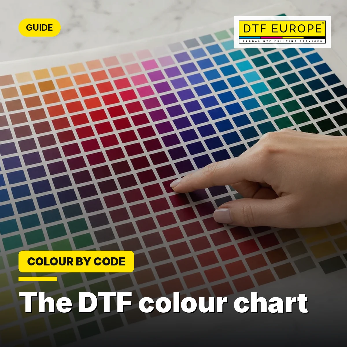
You picked a deep burgundy and got a red. An electric blue that glowed on screen printed flat. This guide explains why it happens and gives you the exact method so it never happens again: colour as a number, in Adobe RGB, from your software to our printers.
What the DTF colour chart is (and why you need it)
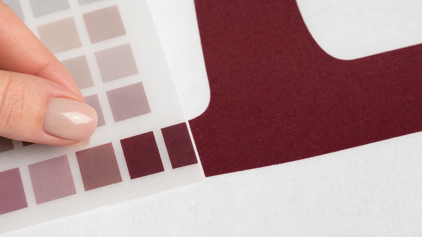
The colour chart is our colour reference tool: 971 colours printed on real DTF, each with its own code (C1 to C971). It is not a pretty catalogue: it is the tool that turns “I want this green” into a repeatable result, order after order.
It has two parts that work together:
The physical chart, printed on our own machines on DTF film. It is the only valid visual reference of the final colour: what you see on it is literally what will come out on your transfer.
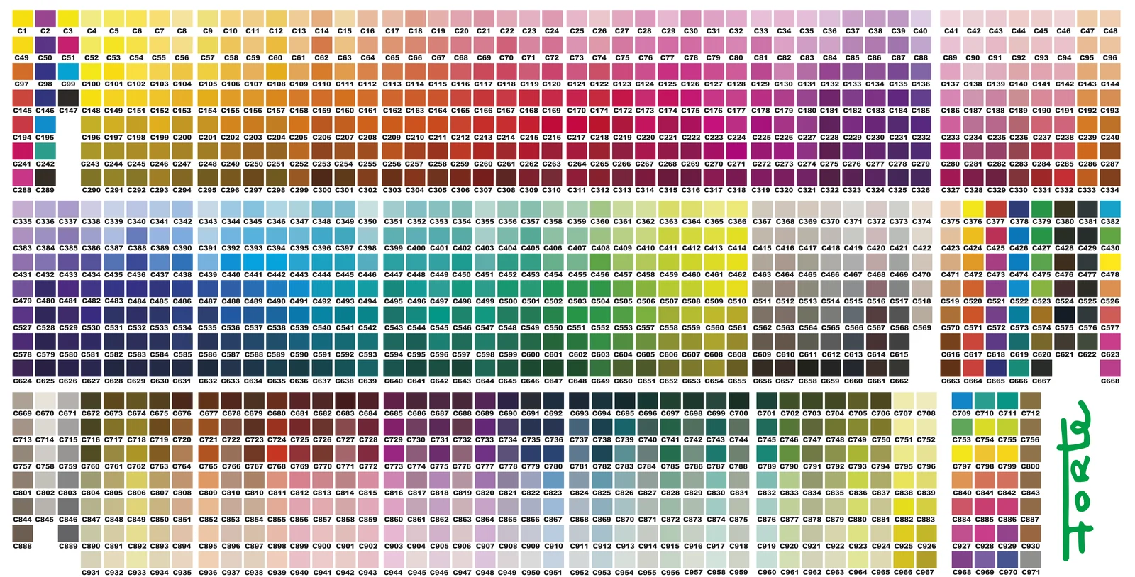
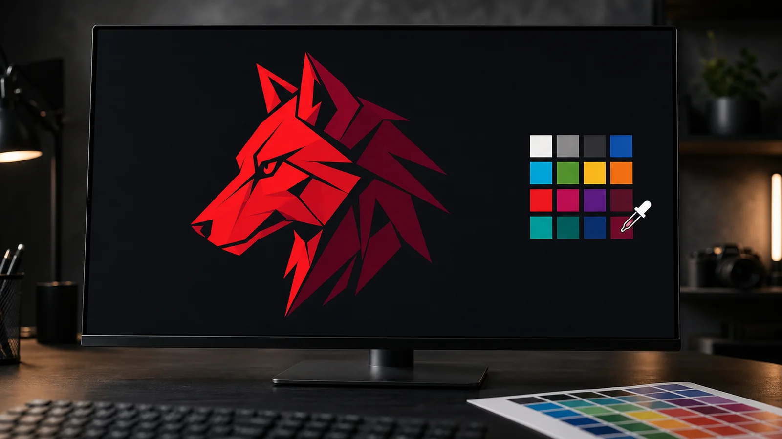
The digital chart (vector for Illustrator, PNG for Photoshop), where you take the exact value of each code and apply it to your artwork. Both versions are in Adobe RGB (1998) with the profile embedded.
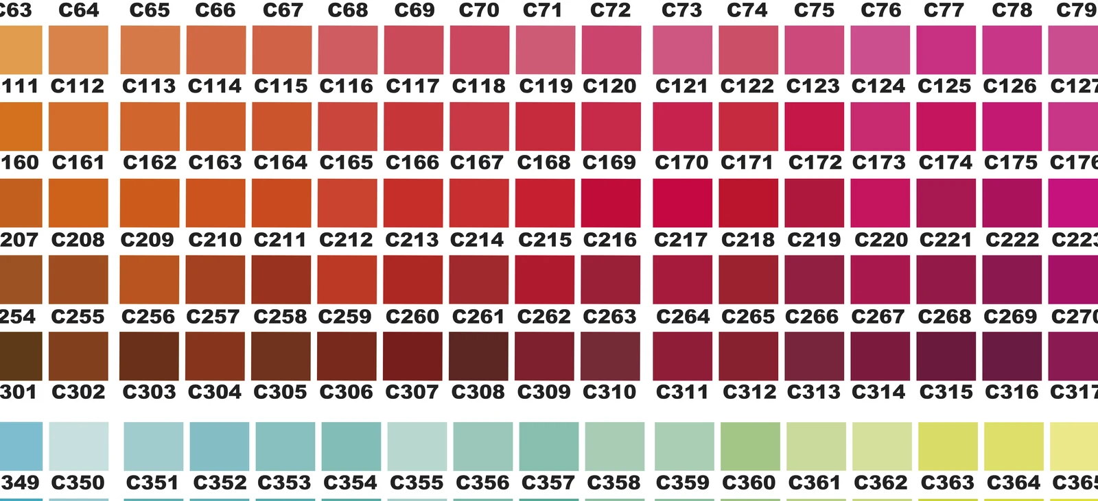
The idea that changes everything: colour is a number, not what you see on screen. If your file carries the right number in the right colour space, the print matches the swatch on your physical chart. Every time.
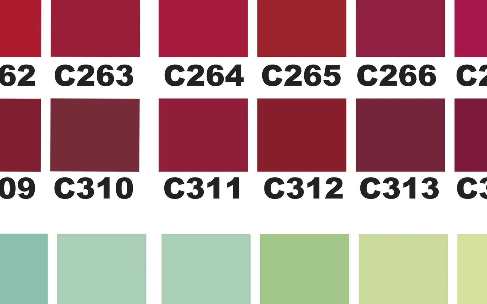
Why your screen lies to you: the gamut, explained simply
Your monitor creates colour with light. A printer creates it with inks. And light reaches colours that inks physically cannot reproduce: that reachable range is called the gamut.
That is why an electric blue or a neon green that dazzles on screen “drops” when printed: ink goes as far as ink goes. It is not a machine fault, and it is not your file. It is physics, and it applies to every printing system in the world.
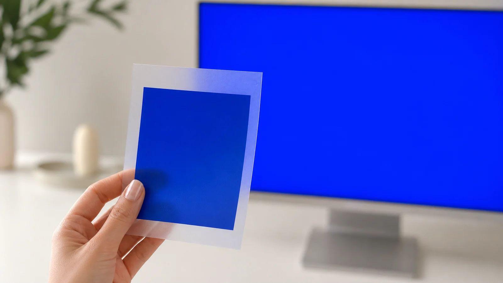
Here is the real value of the colour chart: every colour in it sits inside the printable gamut. If you choose from the physical chart, the electric-blue surprise cannot happen. If you choose from your monitor, you are gambling.
RGB or CMYK? The definitive answer
The question we get most from print studios coming from offset. In DTF the answer is clear:
Always work in RGB with the Adobe RGB (1998) profile, and never convert to CMYK. We handle the conversion to ink ourselves, with the exact profile of each machine and film. Our presses print natively from RGB with an 8-colour set, so your RGB file takes the shortest possible path to the film.
Why? Because your software’s CMYK (FOGRA39, made for offset presses) is not our printers’ colour space. Every extra conversion drifts the colour: you convert to a generic CMYK, we have to reinterpret it, and the burgundy lands somewhere else. When the file arrives in Adobe RGB with the chart number, the route is direct and the colour lands on the exact swatch.
Set up your software once
In both Illustrator and Photoshop, open Edit > Colour Settings and leave this configuration fixed:
If your team works in another space (sRGB, or an offset CMYK), the same code will print a different colour. Adobe RGB (1998) across the whole journey: document, applied colour and export.
How to apply the colour in Illustrator (vector)

- Open the vector chart next to your artworkIt is already in Adobe RGB (1998). If Illustrator asks about the profile, keep it.
- Set your document to RGBFile > Document Color Mode > RGB Color.
- Choose the colour on the physical chart and note its codeThe printed chart is the real reference; the screen is only a guide.
- Apply the exact valueEyedropper on the digital chart swatch, or type the RGB value of the code. Check the fill stays in RGB.
- Export with “Export As”PNG · 300 dpi · transparent background · real size. Never “Save for Web”.
How to apply the colour in Photoshop (bitmap)
- Open the PNG chart and keep its profileIt ships with Adobe RGB (1998) embedded.
- Prepare your documentRGB · 8 bit · 300 dpi · real size · Adobe RGB (1998) profile.
- Choose on the physical chart, capture on the digital oneEyedropper with sample size “Point Sample” (1 pixel) on the centre of the swatch, or type the value.
- Apply it and stay in RGBNo CMYK at any point of the process.
- Save with the profile embeddedSave As > PNG with “Embed Color Profile” ticked. Transparent and at real size.
The 4 mistakes that ruin colour (and how to avoid them)
AVOID
- Picking colour “by eye” from how it glows on your monitor
- Converting the artwork to CMYK “because it prints with ink”
- “Save for Web”: converts to sRGB and dulls the colour
- Using a chart printed by another company or another machine
DO THIS
- Choose on the physical chart; apply the code’s number
- Everything in Adobe RGB (1998)
- Export PNG 300 dpi, transparent, real size
- In doubt? Send us the code and we validate your file
Batch to batch: the honest truth about materials
All the inks and films we use are certified — and, like practically every consumable in the DTF industry worldwide, they are manufactured in China and arrive in production batches.
Batches matter. A new ink batch can carry slightly more or less pigment. A film batch can come with more or less coating. A supplier can quietly adjust a chemical formulation. These micro-differences are outside any printer’s control — even outside the manufacturer’s — and they can nudge a colour slightly from one batch to the next.
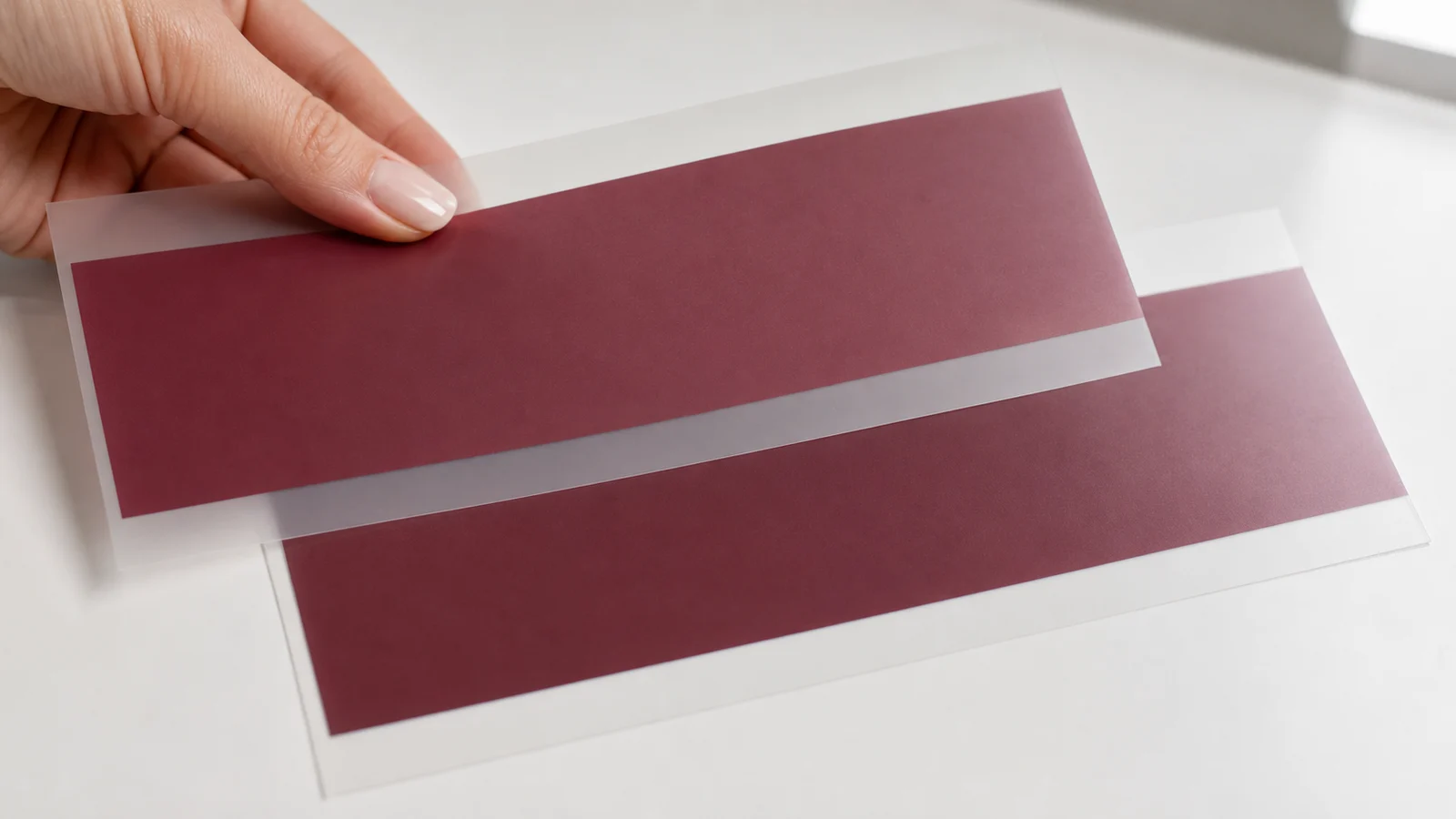
How we keep it under control: your work and our colour chart are printed on the same machines, and repeat orders run on the same machine and colour profile. For colour-critical jobs, send us your code before a large run and we validate it against the current batch.

Frequently asked questions
Why does my electric blue look dull when printed?
Should I design in RGB or CMYK for DTF?
Can I use another DTF company’s colour chart?
What file format should I send?
Why did a colour shift slightly between two orders?
How do I get the physical and digital chart?
Get your colour chart and print without surprises
Physical chart + digital charts + usage guide. Choose by code, send us your PNG in Adobe RGB, and the colour you choose is the colour we print.


